
Vembla
Vembla offers its customers home delivery of groceries within an hour in Stockholm's inner city. During the late summer of 2021, they plan to launch their new service where they will offer their customers to have goods delivered to their homes within ten minutes.
Our assignment was to design the interface for the new service.
Team
Project Leader, UX/UI Designer, Front- and Back-end Developers.
My Role
UX/UI Designer.
Tools
Figma.
The Design Process
Project Brief
Over the past year, Vembla has investigated its target group behaviour and based on that, they have created a new service. They will now offer home delivery of groceries and groceries in 10 minutes within Stockholm's inner city.
They have built their own warehouse, a so-called Dark store, which will serve as warehouse for the new service.
The current application works well and as far as it is possible, its functions can be reused in the new application. The focus was to make the user find the needed goods easily, get an overview of all goods offered, feel inspired and be able to complete the purchase in a smooth way.
As the time was limited, no UX research should be conducted. Testing was to take place after launching the service.
Ideate Visual Material
A graphic profile was created based on the words fast, innovative and fresh.
A component library A design system was created to make the application's appearance uniform and to make the work smoother. Below are some of the components.

Prototype Wireframes
Next step involved researching the current application and some competitors in order to get an idea of what features similar services offer. A brainstorming workshop and some sketches made us the decide on what the UX flow could look like and thus wireframes were created. Based on the sketches, an application emerged and design sketches and an interactive prototype were created.
The UX flow created in Balsamiq and the UX wireframes are presented below.

UX wireframes

Iterate Design Sketches
Previous briefs and feedback resulted in the design sketches below.
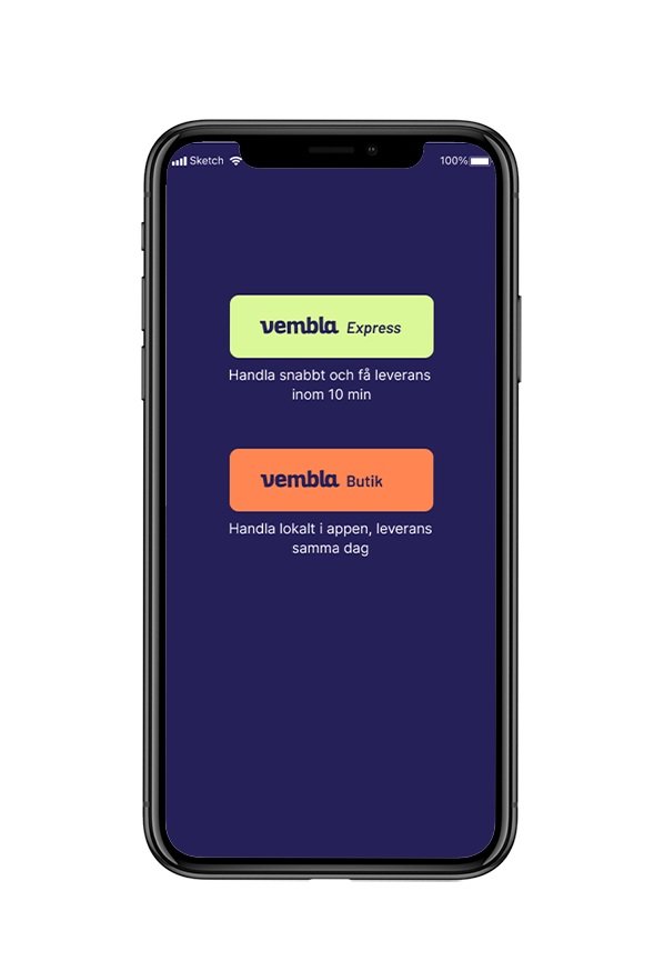
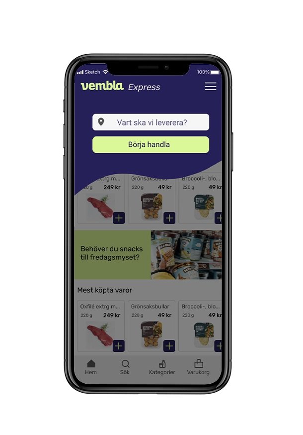
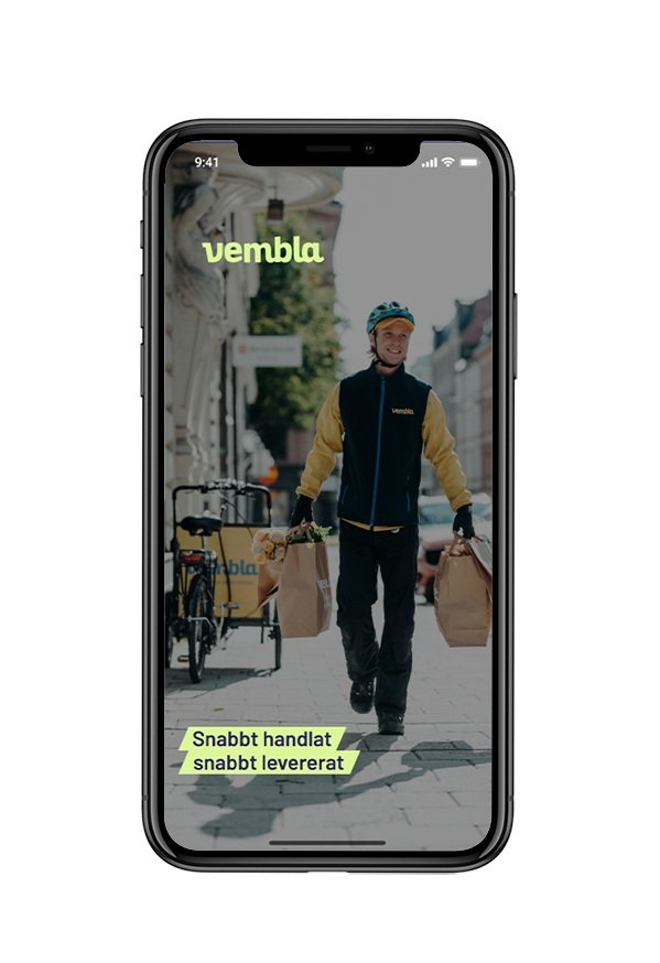
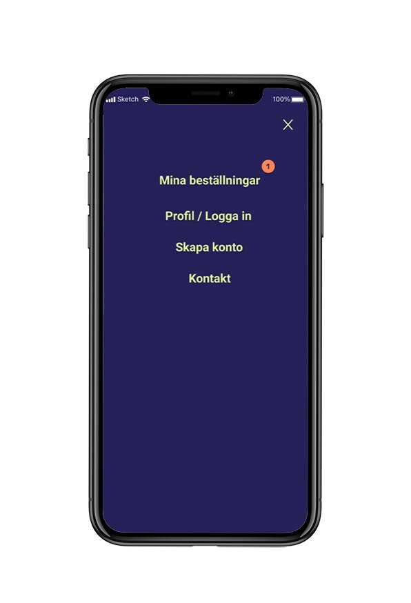
From left to right:
Start screen where the user can choose Vembla Express or Vembla Shop
Splash screen
Start screen for Vembla shop, the user needs to put in address before continuing
Shop
Goods and categories
Checkout
Payment
Menu


Final results & reflection
Vembla appreciated the design and were happy about both the graphic profile and the design sketches of the new application. Everything that they required has been implemented and the service has been launched. As Vembla already has a large pre-coded library with functions from the previous application, there are some deviations from the design sketches presented here.
It was a fun yet challenging project. Food tech is a broad area with many players. The possibilities of what can be created feel endless, which is exciting. At the same time, it makes it so much more important that the service we create is designed in a way that attracts consumers to use it.