MiniCam
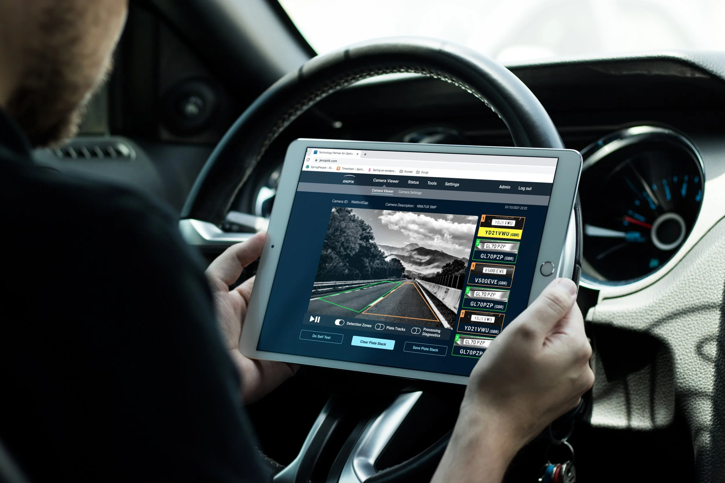
Jenoptik manufactures speeding cameras that are used in the judiciary in Australia and England, among other places. As a new camera was about to be launched, my team was responsible for creating the UX and UI design of the software that is used when installing the camera.
Team
Project Leader, UX/UI Designer, Front- and Back-end Developers and Installation Engineers.
My Role
My task was to create the UX and UI design. Due to the lack of brand guide lines and a design system I also created a limited graphic profile and a design system.
Methods & Tools
Double Diamond & Figma.
The Design Process
Project Brief
Jenoptik has been developing speeding cameras for a long time. There is a n existing software for when engineers are to install these cameras. This software is dated from a visual perspective and users complain about it being hard to understand and thus use. Partly because it was not designed with users in focus and partly because it is several years old. It has too many settings that have been added through the years.
My teams mission was to update the UX and UI design of the web-based software for the new camera that will be launched in order to make the user experience better.
Empathize Workshop #1
The project had a limited time frame, no UX research was to be done. To understand the target group a workshop was held with the MiniCam team. The existing software was presented followed by questions from my team.
The main focus areas were:
How does the user flow look like
What functions are the most important
In which situations is the software being used
How can we simplify the installation
“The new software needs to be simple,
it is way too complicated today”
Findings
When installing a camera users are usually outside on the road or in a car. There can be a lot of noise, too sunny or lack of light. The user installing the camera may be installing one for the first time thus making it more difficult. The software used today is very complex to learn, it has very many settings, some of them aren’t being used and the text is very small. In addition the user need to exit the software when controlling the log files.
In conclusion, the software is too complicated to use, it needs to be simpler. The workshop resulted in the UX and UI feedback below:
The settings not being used need to be removed
There will be two user views, Expert user and Basic user
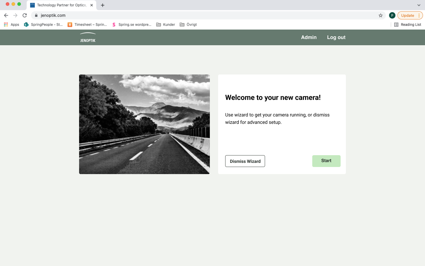
A wizard needs to be implemented to simplify installation (preset settings)
It should be clear for the user when and if settings have been edited
Text and buttons need to be bigger
A dark mode and a light mode is necessary
Existing software design

Ideate Visual material
When installing the camera the engineers prefer using a darker theme, especially when the light conditions may be questionable. My team was asked to create a graphic profile based on a dark theme, which would be the default one. If any user wishes to use a light theme there should be one accessible as well which is why we also created a lighter one. The graphic profile and some of the components are presented below.

Prototype UX Wireframes
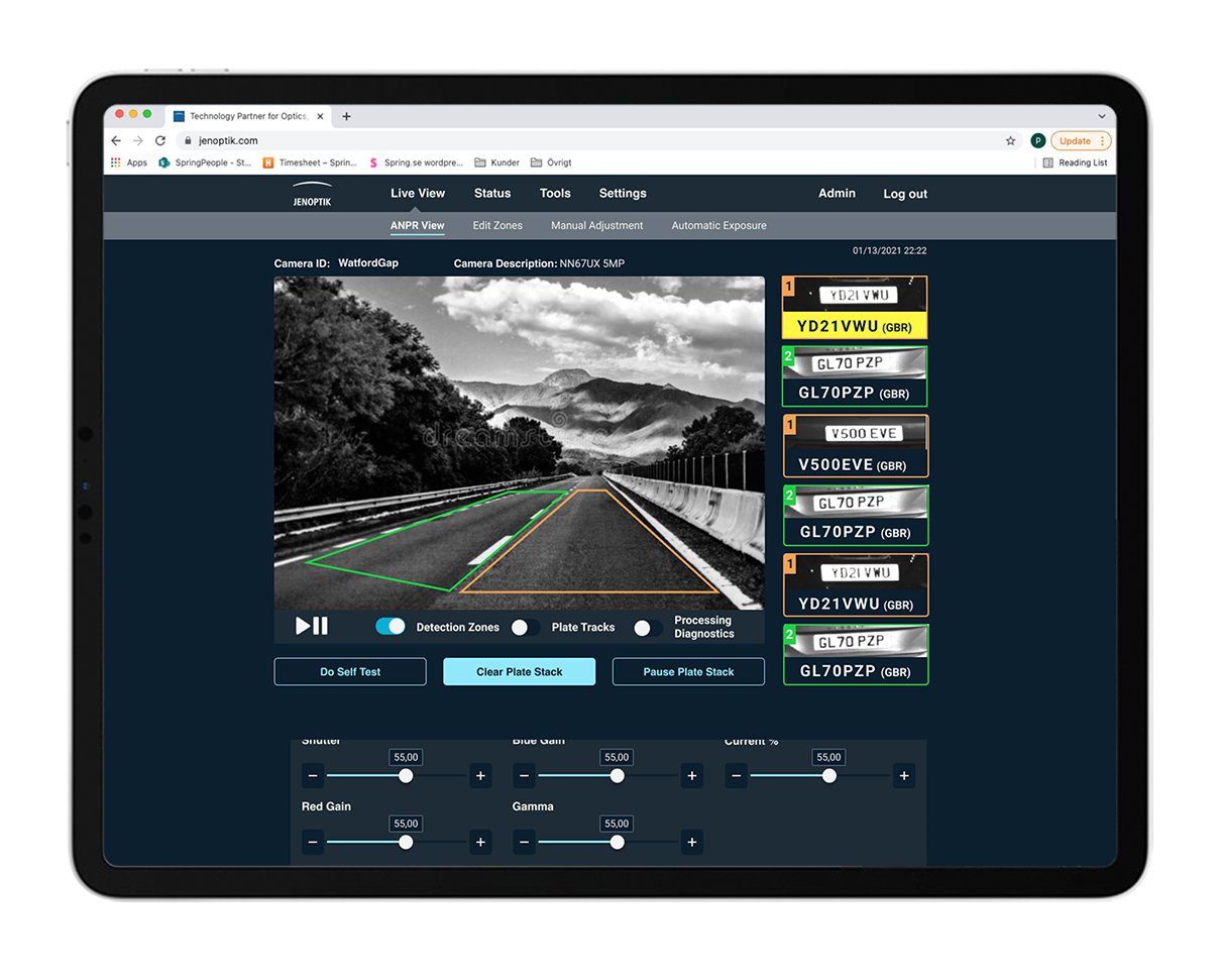
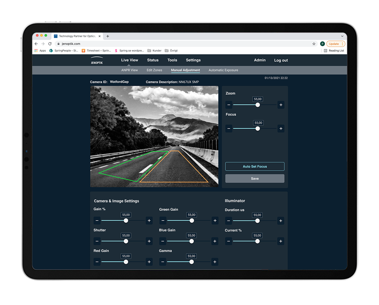
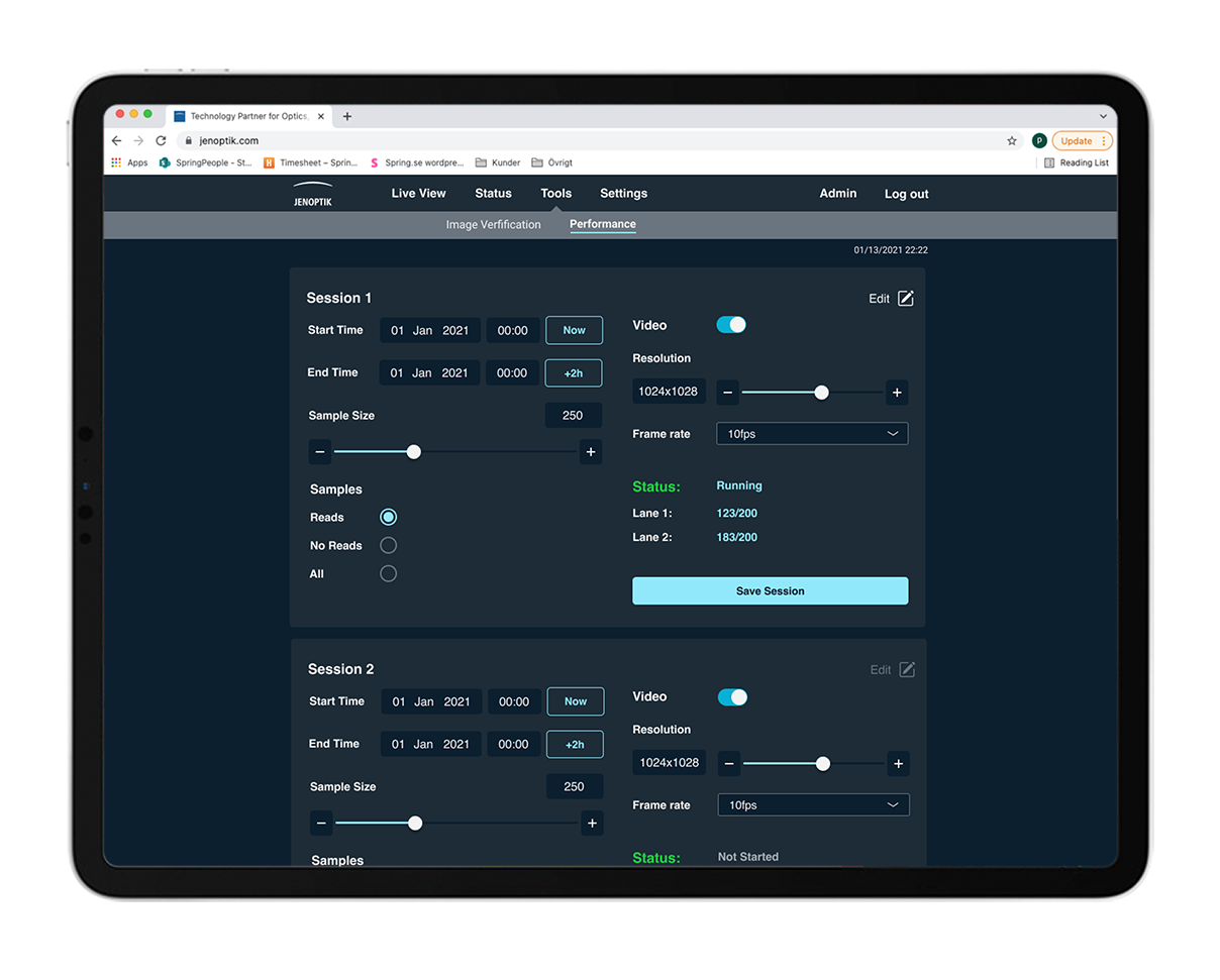
Having the workshop feedback in mind UX wireframes began to take form. A few of the screens are presented below. As the software is hosted on a website we decided to keep the tab design.
The different contents of the tab were discussed a lot. Because of the vast functions we needed to understand exactly how the user would act when looking for X or Y.


Test Workshop #2
The UX wireframes were presented for the MiniCam team together with the graphic profiles and a few screens on how they would be implemented.
Main takeaways:
Use the bright blue colour for important functions
All text across the whole software needs to be bold
More functions will be removed to simplify the software
Camera view should be as large as possible
Prototype UI design
The UI design was formed with the workshop feedback in mind. Our main objective was to present all text in a clear way and to make important functions stand out in order to minimise mistakes as far as possible. The default theme and the light themed screens were tested in different lightning and surroundings to verify that the colour schemes will work under different conditions.
“Do we need this setting?”
”Would a user check for this setting here?”
“Should a user be able to edit this?”
The design sketches were passed on to the MiniCam team. The UI and UX design was iterated on a few times during the process. Mostly because some of the settings were being questioned and discussed with different aspects in mind.
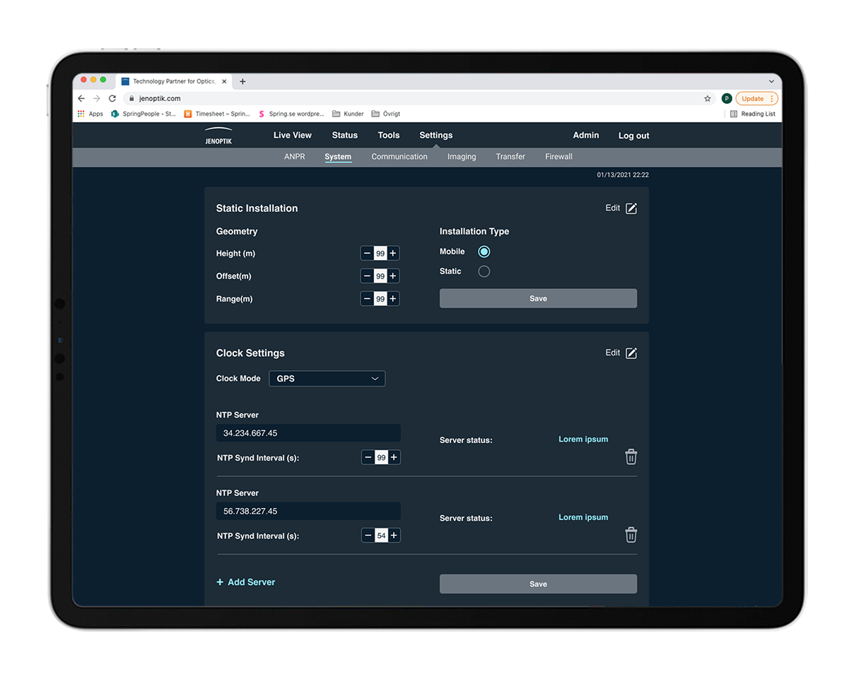
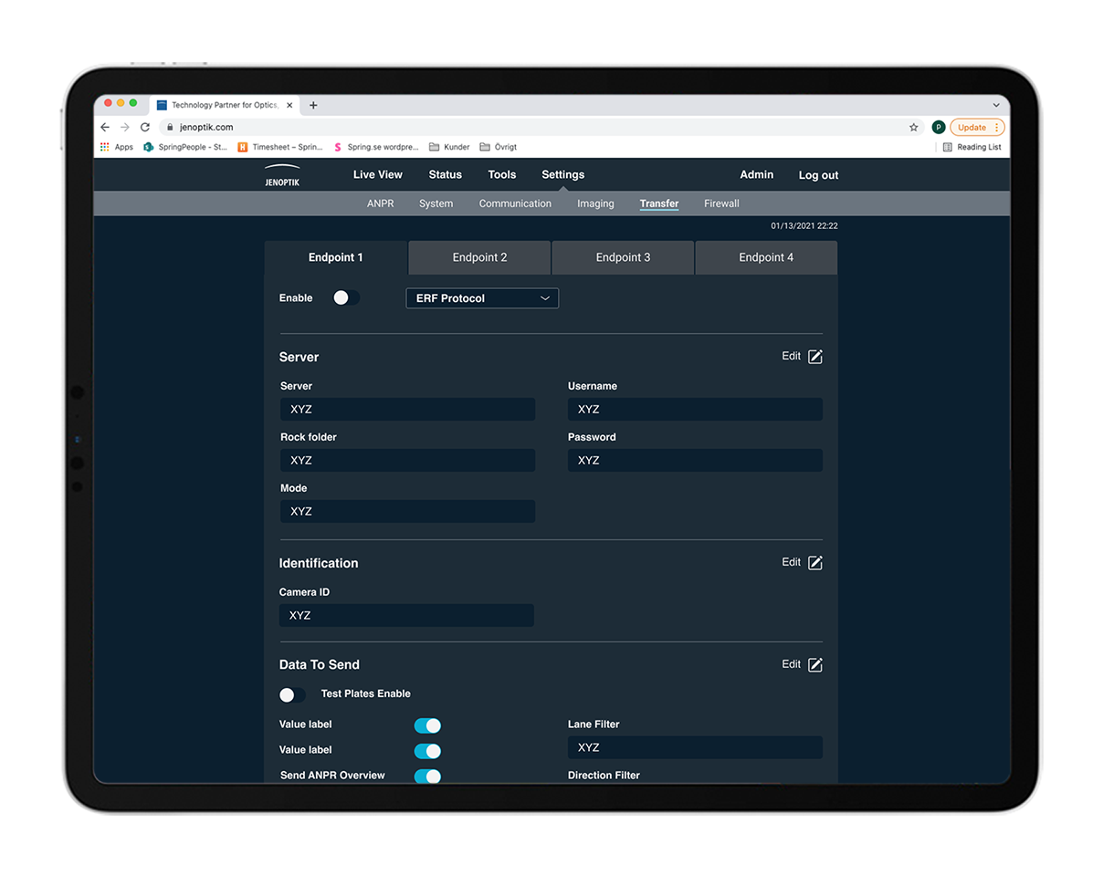
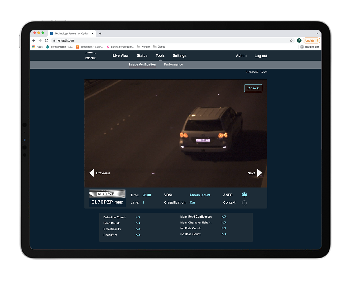
Below is the final Expert user UI design presented.
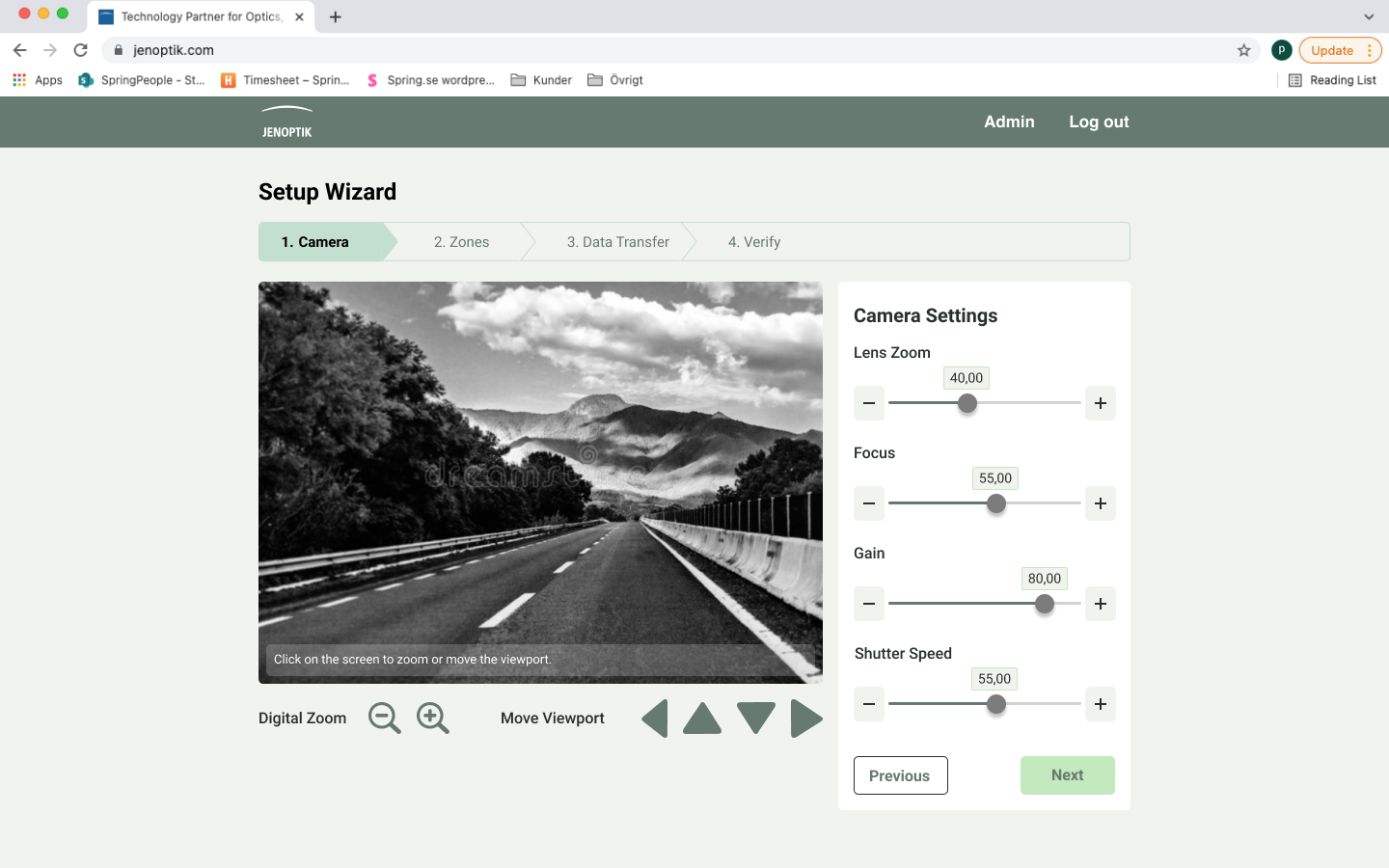
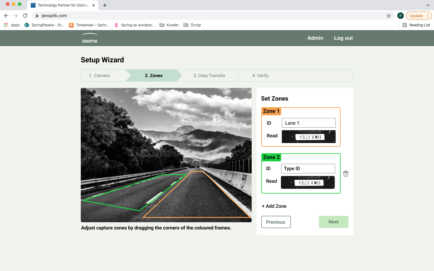
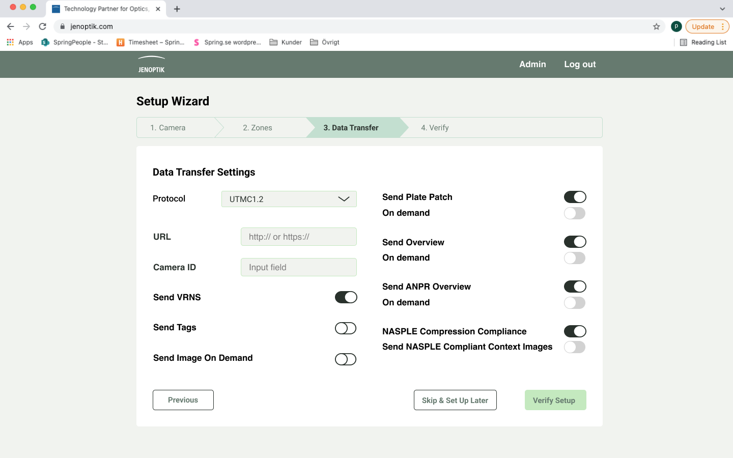
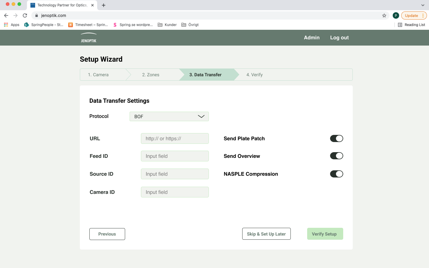
Wizard
As stated earlier, the software consists of multiple settings. The camera will come with preset settings to make the installation easier for the user. Although, some settings may need alterations depending on the conditions of the place where the camera will be operating. The wizard design is based on these settings and guides the user through four set up steps.
Below the light theme is implemented in the design of the wizard.

Final results & reflection
The design process of the MiniCam software was exciting yet challenging. To re-design a software that is already existing was at sometimes difficult. My team was catering towards the basic user group, the product owner and the expert user group (engineers) which made it challenging to know whose opinion to prioritise.
I believe the key factor in this project was the close communication with the MiniCam team. A few unofficial meetings were held with fewer people involved which gave my team the opportunity to really dig deep in to anything we were doubting. We learned to question the software a lot in order to understand it from all perspectives.
As our work was very much appreciated Spring was asked to also be included in the development of the software.